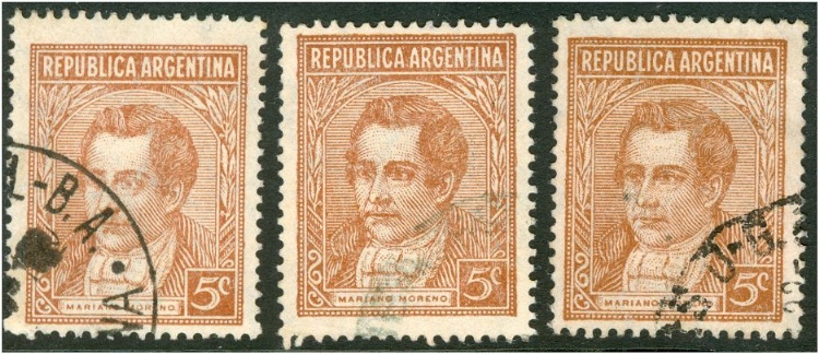
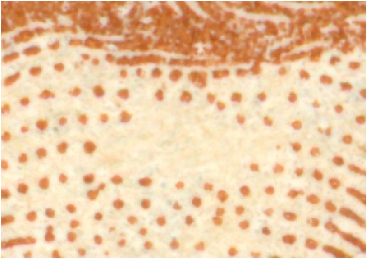
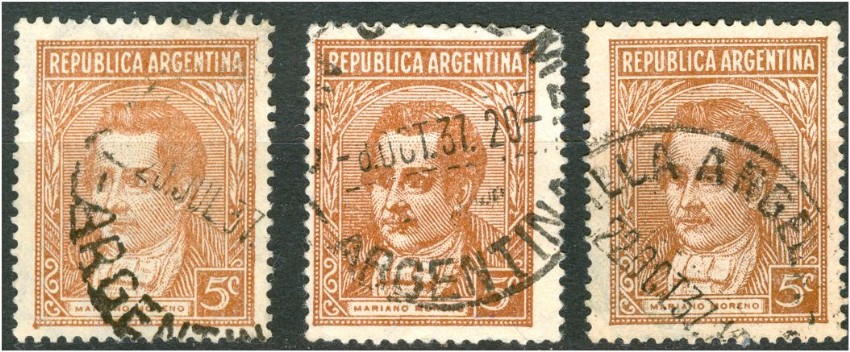
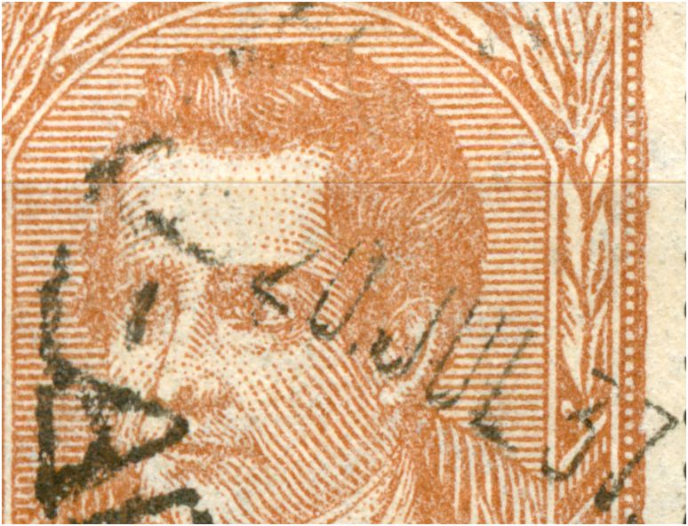
Let's go on with the next face values! The difference between the first offset-litho and the typography version is mainly the general difference between offset-litho and typography. Still you may see some parts that slightly differ: the offset-litho has a very egally spread ink and the edges are clean; the typography has edges that uneven especially in the corners! The empty forehead in offset-litho: The empty forehead in typography: |
rubiera 07 Oct 2010 09:58] Rein, If we are discussing the 5c Moreno, I think that there are several printings, ÛA1935 1E1 offset (regular and departmental) 00331937 1E1 typographed 'clean' (regular, departmental, servicio oficial) 0033approx 1937/8 1E1 dirty face 00331E4 from booklets 1940 typographed 0033939 First Clay typographed 00331943 Second Clay typographed 00331943 2D straight rays dull paper servicio oficial only[/quote] Tony, OK, but I was discussing the various types [designs] here rather than the types of paper... offset-litho:
typography:
I will come back to this subject later on.... |
As we could see in the previous postings the typographed 5c Moreno of 19.03.1937 also had its forehead wiped off just like the offset-printings! : |
The Ministerials also had their foreheads wiped off: all with ascending watermark! |
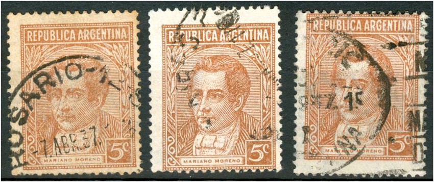
Pretty soon the 5c Mariano Moreno in typography was re-drawn! Type I having been issued on 19.03.1937 and printed on normal, uncoated paper; see Leopoldo Tenorio Casal: 5c Tercero y ultima valor de fotograbado estereotipado, por su uso, es el que más variedades tiene, se inicío el 19 de marzo de 1937, sobre papel común filigranado Sol R.A. 9 1/2 mm. de diámetro, distancia de los soles entre si 29,5 x 17,75, posicíon de filigrana horizontal, lo que debe tenerse en cuenta para su independizacíon, hay doce impresíones. It had its successive type with a pointed forehead within a four [4!] months - type II: |
"rubiera 06 Jul 2008 19:35" Encuentro tres impresiones durante estos aos. La primera impresion es sobre castao claro y sobre el papel 1E1. Este es uno de los mas antiguos que tengo, de Junio de 1937. [img]http://www.somestamps.com/images-arg3551/reference-collection/foro/200807/5c-typo-1/1E1t-01-37.jpg][]) Tony Rubiera turns out to have an even older date stamp! It is rather strange that Leopoldo Tenorio Casal did not mention the 2nd type of the 5c Moreno in typography at all! When he wrote his article in 1947 he must have had enough time to study the 5c stamps! |
However, we should still be careful with the date stamps! Are they reliable???? At the left: type I - 12.03.1937 and at the right: type II - 20.07.1937. anyhow, the 5c in typography lasted a few more years having printing orders in 1939, 1940 and 1943 on various types of paper! The cylinders/plates seem to have been made up from loose stereotypes since 1939 [coated], 1940 [not coated] and 1943 [coated again]. The characteristic that got introduced in 1939 I will refer to as type III.... On the sheets we will find both type II and type III without a regular pattern! |
Type III - on coated paper in 1939: |
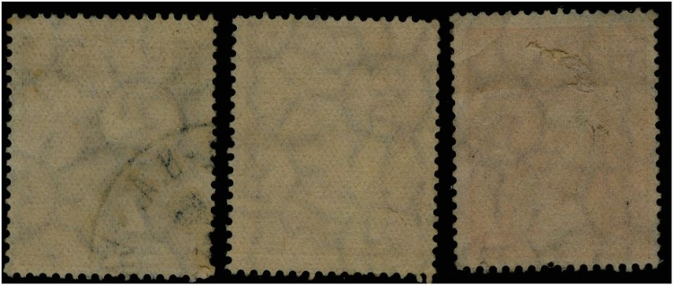
The coated paper has a symmetrical paper mesh! Although some may see some "rayado" in it - the red lines! |
"rubiera 07 Oct 2010 16:01 " Thanks for this discussion, Rein, I get it now about design versus printings. tony Tony, have you ordered the book? It took 2 weeks for me to get it [to Europe]. I am discussing the Pettigiani book chapter by chapter. After having dealt with the various types I will discuss the separate face values - the general table, the plate flaws and the S.O. table [made by Angelo Fredy Yedro].... |
The 5c Mariano Moreno in typography on paper "mate lustroso": Not all are type III! |
The 5c Mariano Moreno in typography on coated paper - 1939 printing order": All are type III although at times the dot is awfully tiny! |
Copyright © Printing Matters (Mail to the webmaster Rein Bakhuizen van den Brink) Last updated on July 28, 2018 |